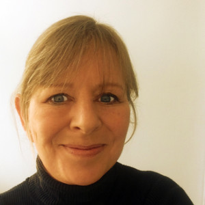
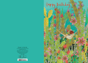
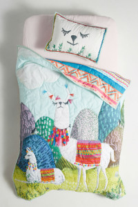
With her work gracing the covers of Breathe and Flow magazines, let alone appearing in Vogue, on bedding for leading retailer Anthropologie as well as on the Summertime greeting card range from Roger la Borde, freelance illustrator Jane Newland (represented by the Bright Group artists’ agency) is having to get used to an increasingly high profile.
Here she shares her story and her inspirations.
In the beginning…

“I’m a child of the 70s, very short sighted, and deaf in one ear. I think it made me quite self-contained, and it’s probably where my obsession with detail began. I was naughty and didn’t wear my glasses, so the only things I could see properly were the things right in front of my nose! My family is definitely on the creative side – both grandparents, my parents, an uncle, a cousin and my brother and sister all studied various subjects at art school, so there was no escape from it! I was surrounded by loads of artistic influence. So I studied illustration at art school, got a degree, worked a variety of awful jobs while also freelancing, mainly for my brother’s design company. This gave me a really brilliant grounding in working as an illustrator, and I’ve worked with some amazing clients. Wanting more from my career, I started to show more personal work online, which eventually led to me joining Bright.”

What or who inspires you?
“I was inspired to become an illustrator by my dad and grandfather. My dad is an amazing landscape painter of moody, glorious-skied Norfolk landscapes, and my grandfather, who was an architect by trade, also painted illustratively, particularly once he had retired. His work was reminiscent of Arthur Rackham, and as a child I loved sitting beside him watching him work.
Now, I am still inspired by dad and granddad mostly and I like to think I’ve kind of merged the two into my own style.
I love looking at other artists work on social media, and I’m sure I’m influenced by what I see. Favourites at the moment are Yasmeen Ismail, Marc Martin, Karl James Mountford, and too many more to mention. I’m also inspired by the photos I see of people’s lives, and I love seeing young up and coming illustrators’ work”

Where did your distinctive contemporary style come from?
“My current style began to emerge over the last couple of years. I was actually on the verge of giving up illustration, and decided just to forget about my style, instead simply doing what came naturally, and drawing what pleased me — not what I thought anyone else wanted to see. And out it popped!
I’d had an email from the Bright Art Licensing team detailing trends, inspiration and ideas and one of the trends was ‘adventure’. It sparked something in me, and I decided that for my personal pieces of work I would take myself on an adventure. So I began by imagining where I would like to go, and, much to my genuine amazement and delight, it seems lots of people would like to go to the places I imagine too!”

How much time do you spend on an illustration?
“The detailed pieces take me between three and five hours. It’s my treat late on a Friday afternoon to do a personal piece of work. I take part in #colour_collective on Twitter, where a huge bunch of lovely illustrators post their artwork using a designated colour every Friday at 7.30pm (UK time) So that’s my deadline. I start with a potential colour palette in mind, which includes the colour of the week, and sometimes I will have an idea of what I’m going to draw, sometimes not. I begin regardless, with a general background layer, and just keep adding more and more layers, building up details and intensity of colour. All the details, the billions of little leaves and grass etc, it’s just doodling on a large scale really!”
Jane’s work appears on all manner of products, both commissioned and licensed. Clients include retailer Anthropologie, Breath magazine, Egmont, Flow magazine, Harper Collins US, Leonidas chocolates, Little Tiger Press, Times Square Hong Kong, Usborne, Vogue magazine and Roger la Borde, who will be exhibiting Jane’s work on its Summertime range at Top Drawer (September 9-11).
* This article initially appeared in the September edition of Progressive Greetings, which is out now.


