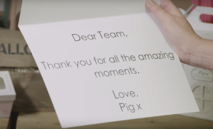
Personalised cards and gifts retailer Moonpig has totally overhauled its brand and brand image, dropping its iconic pig character and .com that have been integral since its launch in 2000.
Rather than sweep its mascot that has ‘brought home the bacon’ for so many years, under the carpet, the Moonpig team released a Hogumentary on social channels, telling the story of the pig and his inter-relationship with the Moonpig business and how he is now enjoying a new love life.

The completely new look and feel extends across all brand touchpoints from web, app, product packaging and marketing, encompassing design, user experience and tone of voice.
A fully-fledged consumer marketing campaign around the re-brand is being launched next week.

While the pig is no longer the face of the brand, pink remains the lead brand colour and the new ‘snout’ digital icon winks back to its piggy heritage.
“The brand experience hadn’t kept pace with the exciting and colourful reality of our business today – for our customers or for our team” said Moonpig’s creative director James Turner. “Moonpig’s all about making someone’s day brilliant. We started with cards and now offer a huge range of gifts along with being a top-three UK top online flower seller for all the big occasions.”

The Moonpig business overall continues to enjoy strong growth and greeting cards remain a major part of that, with sales continuing to grow at a healthy rate.


