This year’s Henries greeting card industry awards event are to take on a 1980s theme, which taps into a vibe that is already showing itself on the card racks.
Loud clashing colours, zany patterns, worm-like squiggles, terrazzo and a mishmash of imperfect geometric shapes – in a flashback to the 80s and 90s, card designs are embracing the post-modernist style made popular in the 1980s by the Milan-based Memphis Movement.
Playful, bizarre and fun, Memphis design has been described as ‘a shotgun wedding between Bauhaus and Fisher Price’, but it is hitting the mark with millennials with its saturated mint and coral, pastel pink and cobalt blue colour combinations and uplifting, rebellious and outlandish aesthetic.

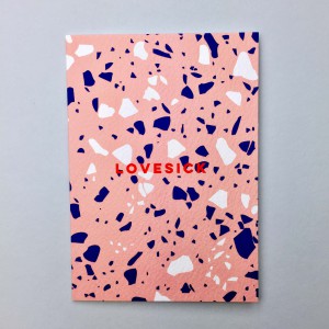
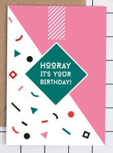
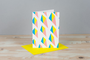

Lydia French, founder of The Brighter Times and creator of the More Good Vibes range for card publisher Papagrazi, shares her views on why this is very much a trend for now.
“Love or hate the 80s, it was definitely iconic – and not only for its unforgettable aesthetic, but its remarkable technological breakthroughs – like the invention of the artificial human heart, and of course the launch of the ubiquitous Apple Mac (my personal best friend). MTV went on air for the first time becoming one of the most influential media channels for music, pop culture and entertainment. It was a time of excitement, of reinvention and in many ways hope in the backdrop of the Cold War.
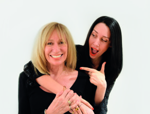
Granted trends are naturally cyclical, but I feel the ‘attitude’ of the ’80s is reflective of today’s socio-political climate also. Despite a time of war mongering, political anxiety and environmental issues, there seems to be a strong underlying sense of optimism and ambition too. Voices are being heard, minds are being opened, and outlooks and perspectives seem to be shifting. Bold statements are being made, there is no time to be quiet so why should design be so? Let’s be brave with graphics, use bright colours and make a statement!”
What was your inspiration for the theme and artwork style?
“Born in 1982, I witnessed Optimus Prime keep the world safe, have John Hughes take my drama seriously, and saw technology advance so I could walk the streets listening to the raddest beats on my yellow Sony Walkman. I look back at my childhood with such nostalgic charm, it was so beautifully colourful, literally and metaphorically. 80s aesthetic was expressive, dynamic and fun. Grace Jones, neon, shoulder pads, all aspects of design were disruptive and attention grabbing. Precise, bold statements were made, yet all with a free spirited approach. Also, some of the best and most influential advertising campaigns came out of that decade, like the world-renowned ‘Just Do It’ by Nike.
The Brighter Times is a mission to make people feel good and More Good Vibes greeting cards are a perfect way to remind people how incredible they are, so the ’80s naturally felt like the era to pull design influences from.
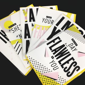
Using loud typography, pops of colour, geometric shapes and fun patterns, I too wanted to create designs to the point. In this mad and fast moving age, I’ve learnt it’s important to take a break from the ‘buzz’ and appreciate what life can bring us and all the good it can offer – mainly each other. To quote Ferris Bueller, “Life moves pretty fast. If you don’t stop and look around once in awhile, you could miss it”.”


