Clouds of stars and constellations, geometrics and tessellations and inky deep blue and purple hues, the ethereal, galactic aesthetic on greeting cards continues as a key design trend.
Reflecting the reach for the stars is ‘Ultra Violet’, Pantone’s Colour of the Year for 2018. Embodying celestial and spiritual meaning, it’s also a colour that symbolises mystery, the otherworldly and mystical, and exploration, as we look to the cosmic skies for a higher plane of existence and self-discovery.
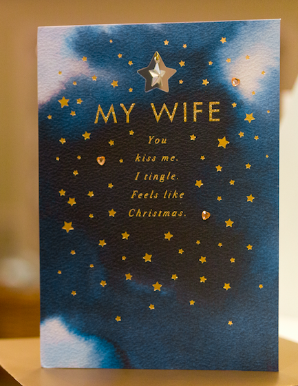
Orbiting the ‘spiritual big bang’, card designs are starry and dreamlike, in midnight blue and violet jewel washes, enhanced by metallic tones and finishes. This beautiful contrast of dark ethereal shades and light-catching metallics are perfect for Christmas card designs, capturing the magical enchantment and fairytale of the season.
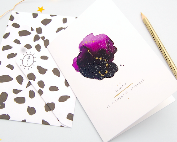
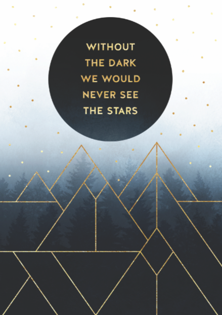
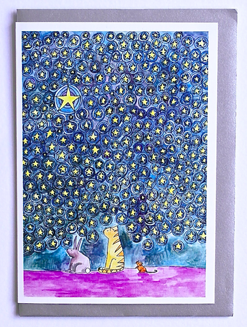
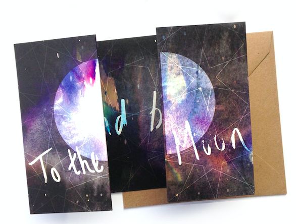

Trendspotter: Kate Van Spall, art director for Hallmark shares her take on how the publisher has ‘reached for the stars’ with this trend.
“In terms of seasonal trends we noted predictions that consumers would be seeking fantasy escapism from the turbulent world they live in, whether that is in the form of cosy comfort or otherworldly aesthetics. From our AW17/18 trend Galactica, this look draws on the magical properties of light, a galactic daydream of sparkling stratospheres swimming in shadowed darks. Metallics also being key in terms of a luxury finish across retail already, and featuring in lifestyle and fashion trends, were an obvious ingredient for a special card send.
For this particular look we played with sophisticated inky blue washes, creating the depth needed to scatter gold foiled stars, gems and sparkle – all essential to create this contemporary luxe effect. Consumers drawn to this sparkling, fantasy themed look will appreciate the association of the visual and the written, those tingly and magical feelings of love and connection at Christmas.”
* This is an excerpt from a trends article that appears in Progressive Greetings’ March edition which is out now.


